


For a small or medium-sized enterprise (SME), your website is your most valuable employee. It works around the clock as your primary salesperson, customer service hub, and brand ambassador. To perform these roles effectively, it must be built on a solid, strategic foundation. This is where implementing proven website design best practices becomes essential for success.
This isn’t about chasing fleeting design trends or adding unnecessary features. It’s about creating a dependable, user-friendly digital asset that supports your business objectives, whether that’s generating leads in Leicestershire or selling products across the Midlands. A well-designed website builds trust, guides visitors towards taking action, and ensures every potential customer has a positive experience, regardless of the device they use.
In this guide, we will cut through the technical jargon and focus on what truly matters for business growth. We’ll explore ten foundational principles, breaking them down into simple, actionable steps tailored for business owners. You’ll learn how to structure your site for intuitive navigation, optimise for speed, ensure it’s accessible to all users, and integrate clear calls-to-action that convert visitors into customers. This is your practical checklist for turning your website into a powerful engine for your business.
1. Mobile-First Design
Mobile-first design is an approach that prioritises designing for the smallest screen first, then enhancing the layout for larger screens like tablets and desktops. This is one of the most crucial website design best practices because it acknowledges a fundamental shift in user behaviour: the majority of your customers are likely browsing on their smartphones. By starting with mobile, you focus on the most essential content and functionality, ensuring a clean, fast, and user-friendly experience for the largest segment of your audience.
This approach is more effective than older methods where a complex desktop site was stripped down for mobile, often resulting in a clunky and incomplete experience. Major platforms like Google and Airbnb have long embraced a mobile-first philosophy, delivering streamlined interfaces that work flawlessly on any device.
How to Implement a Mobile-First Strategy
Adopting this mindset means making practical changes to your design and development process. For local businesses, this ensures customers can easily find your location, check opening hours, or make a purchase on the go. This is also a critical factor for Google’s mobile-first indexing, which predominantly uses the mobile version of your site for ranking. If you run an e-commerce store, mastering this is non-negotiable for success; you can learn more about how this impacts your online shop in our guide to e-commerce SEO best practices.
Here are actionable steps to take:
- Start Small: Begin your design process with a narrow screen width, typically around 320px, to represent a small smartphone.
- Prioritise Core Content: Identify the most critical information and actions a user needs. Anything non-essential can be de-emphasised or removed from the mobile view.
- Optimise for Touch: Ensure all buttons and links are large enough to be easily tapped, with a minimum touch target of 48×48 pixels.
- Use Flexible Grids: Employ a fluid grid system and flexible images that can scale and adapt to different screen sizes without breaking the layout.
- Test on Real Devices: While browser tools are useful, testing on actual smartphones is the best way to understand the real-world user experience.
2. Clear Visual Hierarchy
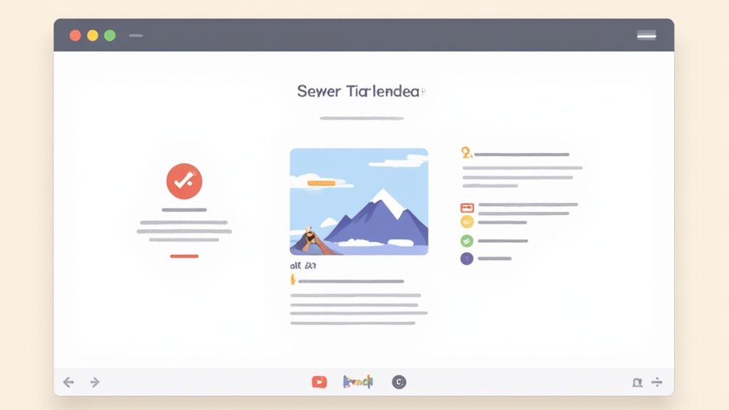
A clear visual hierarchy is a design principle that organises content by using size, colour, contrast, and spacing. It guides the user’s eye across the page, directing their attention to the most important elements first, from headlines to calls-to-action. This is one of the most impactful website design best practices as it makes your website scannable, improves comprehension, and creates a logical flow, preventing visitors from feeling overwhelmed.

This principle is about communication. When a user lands on your page, they should instantly understand what is most important without having to think. Websites like The New York Times master this by using large, bold headlines for top stories, while Apple uses generous white space to draw focus to its products. By establishing a clear order of importance, you make navigation intuitive and the user journey seamless.
How to Implement a Clear Visual Hierarchy
For a local business, a strong visual hierarchy means a potential customer immediately sees your phone number, your key service, and the “Book Now” button. This clarity directly impacts conversions and user satisfaction. Structuring your content this way also supports on-page SEO, as well-defined headings (H1, H2, H3) help search engines understand the relationships between different pieces of information. You can find more details on this in our on-page SEO checklist.
Here are actionable steps to create a strong hierarchy:
- Use Size to Signal Importance: Make the most critical elements, like your main heading and call-to-action buttons, the largest on the page.
- Leverage Colour and Contrast: Use a bold, contrasting colour for key buttons or links to make them stand out. Reserve your primary brand colour for interactive elements.
- Embrace Whitespace: Surround important elements with empty space (whitespace) to give them visual breathing room and draw the user’s eye towards them.
- Establish a Typographic Scale: Define a clear set of font sizes for your headings, subheadings, and body text to create a consistent and readable structure.
- Follow Reading Patterns: Design your layout to follow natural eye-scanning patterns, like the “F-pattern,” placing key information where users are most likely to look.
3. Intuitive Navigation and Information Architecture
Information architecture (IA) is the practice of organising and labelling website content to make it easy to use and find. In simple terms, it’s about creating a structure that is so logical that users can find what they need without having to think. This is one of the most fundamental website design best practices because it directly impacts user satisfaction and conversion rates; if users can’t find something, they can’t act on it.
Good IA ensures a user’s journey through your site feels effortless. It reduces bounce rates by guiding visitors to relevant information quickly, preventing the frustration that leads them to leave. Think of the clear category organisation on Amazon or the simple navigation on Gov.uk; these sites handle immense amounts of information but remain easy to use because of their logical structure.
How to Implement Strong Information Architecture
For a local business, intuitive navigation means a potential customer can instantly find your services, contact details, or opening hours. For an e-commerce store, it’s the difference between a sale and an abandoned cart. The core principle is simple: “Don’t Make Me Think.” A well-organised site builds trust and credibility, showing users you’ve considered their needs.
Here are actionable steps to take:
- Keep It Simple: Limit your main navigation menu to 5-7 essential items. Too many choices can be overwhelming.
- Use Descriptive Labels: Avoid vague terms like “Solutions.” Use clear, user-centric language such as “Our Services” or “Case Studies.”
- Conduct Card Sorting: Ask users to group your content topics into categories that make sense to them. This provides valuable insight into their mental models.
- Implement Breadcrumbs: Show users their current location within your site’s hierarchy (e.g., Home > Services > SEO). This acts as a map, improving orientation.
- Create a Sitemap: An XML sitemap helps search engines understand your site structure, which is crucial for SEO, while an HTML sitemap helps users find pages.
4. Fast Loading Times and Performance Optimisation
Fast loading times are a cornerstone of modern website design best practices. This refers to optimising a site’s speed to deliver content quickly. Users expect instant access to information. A delay of even a few seconds can lead to frustration, increased bounce rates, and lost revenue, making performance optimisation a critical priority.
This focus on speed directly impacts user experience, conversion rates, and SEO rankings. Google’s Core Web Vitals have made page speed a confirmed ranking factor, meaning a slow site will struggle to appear in search results. For example, retailers have found that even a 100-millisecond delay can cost them 1% in sales, highlighting the financial impact of performance.
How to Optimise Your Website’s Performance
For a local business, a fast-loading website ensures a potential customer can quickly find your phone number or directions without abandoning your site for a competitor’s. Slow performance is a common issue we find when analysing sites for new clients. You can start identifying your own site’s speed issues with our guide to free SEO audit tools.
Here are actionable steps to boost your site speed:
- Aim for a Sub-3-Second Load Time: Use tools like Google PageSpeed Insights to measure your current performance and get specific recommendations.
- Compress Your Images: Large image files are a primary cause of slow pages. Use tools like TinyPNG to reduce file sizes without sacrificing quality.
- Leverage Browser Caching: Configure your server to tell browsers to store static files locally, so they don’t need to be re-downloaded on return visits.
- Minimise Code: Reduce the size of your HTML, CSS, and JavaScript files by removing unnecessary characters and spaces through a process called minification.
- Implement Lazy Loading: Configure images and videos that are not immediately visible to only load as the user scrolls down the page, speeding up the initial load time.
5. Accessibility (WCAG Compliance)
Accessibility involves designing websites that are usable by everyone, including people with disabilities. This is a fundamental part of inclusive design and one of the most important website design best practices. The Web Content Accessibility Guidelines (WCAG) provide a framework for making your site accessible to users with visual, auditory, motor, and cognitive impairments. Embracing accessibility is not just an ethical obligation; it also expands your audience and can be a legal requirement.
This practice ensures that all potential customers can interact with your business. Organisations like the BBC and the World Wide Web Consortium (W3C) have long championed these standards, demonstrating that an accessible website is a better website for all users. Neglecting accessibility can lead to a poor user experience for a significant portion of the population and potential legal issues.
How to Implement Web Accessibility
For a local business, making your website accessible means a person using a screen reader can book a table at your restaurant or a customer with motor difficulties can easily navigate your online shop. An accessible site often performs better in search rankings because many accessibility best practices, like semantic HTML and alt text, overlap with core SEO principles.
Here are actionable steps to improve your site’s accessibility:
- Use Semantic HTML: Structure your content correctly with proper heading tags (H1, H2, H3) and lists so screen readers can interpret the page hierarchy.
- Add Descriptive Alt Text: Write clear alternative text for all images to describe their content and function for visually impaired users.
- Ensure Sufficient Colour Contrast: Check that your text has a contrast ratio of at least 4.5:1 against its background, making it readable for users with low vision.
- Enable Keyboard Navigation: Make sure every interactive element can be accessed and activated using only a keyboard.
- Provide Clear Focus Indicators: Visibly highlight which element is currently selected during keyboard navigation, often with a distinct outline.
- Test with Screen Readers: Use tools like NVDA or VoiceOver to experience your website as a visually impaired user would and identify navigation issues.
6. Consistent Branding and Visual Design System
Consistent branding is the practice of applying your company’s visual identity uniformly across your entire website. This involves creating a visual design system that dictates the use of colours, typography, imagery, and interactive elements. Adhering to this is one of the most fundamental website design best practices because it builds user trust, reinforces brand recognition, and creates a predictable, intuitive experience. When a user knows what to expect, they feel more comfortable and are more likely to engage.
This systematic approach prevents a disjointed user experience where every page feels like it belongs to a different website. Industry leaders like Google have demonstrated how a robust design system streamlines development and ensures every component feels cohesive and intentionally designed. This consistency is a hallmark of a professional and credible online presence.
How to Implement a Visual Design System
For a local business, a strong visual identity helps you stand out from competitors and builds a memorable brand. A design system acts as a single source of truth for your brand, ensuring that whether a customer is on your homepage or a product page, their experience is seamless. This professional polish builds confidence, which is crucial for converting visitors into paying customers.
Here are actionable steps to build and maintain consistency:
- Define Brand Guidelines: Document your primary and secondary colour palettes, including specific hex codes. Establish a clear typography hierarchy with a maximum of 2-3 font families.
- Create a Component Library: Design and standardise common UI elements such as buttons, forms, and navigation bars. This ensures they look and behave consistently across the site.
- Establish a Tone of Voice: Your brand’s personality should be reflected in your website’s copy. Decide whether your tone is formal, friendly, or technical, and apply it consistently.
- Use Consistent Imagery: Select a style for photography and illustrations that aligns with your brand. Keep the aesthetic the same across the site.
- Document Everything: Create a central document to house your design system. Make it accessible to your team to ensure everyone is on the same page.
7. Clear Call-to-Action (CTA) Design
A clear Call-to-Action (CTA) is a button or link designed to prompt a user to take a specific, desired action. This is one of the most commercially vital website design best practices because CTAs are the critical link between a user browsing your site and becoming a lead or customer. They guide visitors towards a conversion, whether that’s making a purchase or filling out a contact form, turning passive traffic into tangible business results.

Without effective CTAs, even the best-designed website will fail to generate leads. The goal is to remove ambiguity and make the next step obvious and compelling. Think of Amazon’s unmistakable “Add to Cart” button or Slack’s friendly “Get Started” prompt; these examples use clear, action-oriented language and stand-out designs to drive user behaviour.
How to Implement Effective CTAs
For a local business, a well-placed “Get a Quote” or “Book a Table” button can directly impact your revenue. The design and copy of your CTA should be carefully considered to ensure it is not just visible, but also persuasive. This involves a combination of visual hierarchy, compelling language, and strategic placement.
Here are actionable steps for better CTA design:
- Use Action-Oriented Verbs: Start your CTA copy with a strong verb that communicates what will happen. Use “Start Your Free Trial” or “Download the Guide” instead of passive words like “Submit”.
- Create Visual Contrast: Your primary CTA button should use a contrasting colour that makes it stand out from the rest of the page, but ensure it remains on-brand.
- Leverage Whitespace: Surround your CTAs with plenty of empty space. This helps them draw the eye and prevents them from getting lost in other page elements.
- Strategic Placement: Place your main CTA “above the fold” so it is visible without scrolling. Repeat it further down the page for longer content.
- Test and Measure: Use A/B testing to experiment with different button colours, copy, and placements to see what converts best for your specific audience.
8. Responsive and Flexible Layout Design
Responsive and flexible layout design ensures your website looks and functions perfectly on any device, from a smartphone to a large desktop monitor. It uses flexible grids, fluid images, and CSS rules called media queries to automatically adapt the layout to the user’s screen size. This is one of the most fundamental website design best practices as it guarantees a consistent and optimal experience for everyone, eliminating the need for separate mobile websites.
Instead of creating a rigid, fixed-width site, responsive design builds a fluid foundation that can reshape itself. Modern CSS frameworks like Bootstrap and Tailwind CSS have responsive principles built in. For a business in Leicester, this means a customer viewing your services on their mobile during their commute has the same quality experience as someone browsing on a desktop at home.
How to Implement a Responsive and Flexible Layout
Building a truly responsive site requires a strategic approach to how content is organised and presented across different screen sizes. This ensures usability and readability are never compromised, which is critical for converting visitors.
Here are actionable steps to get it right:
- Embrace Modern CSS: Utilise layout tools like CSS Flexbox and Grid. They provide control over the alignment, spacing, and order of elements, making responsive layouts easier to build.
- Use Relative Units: Design with relative units like percentages (%), viewport width (vw), and rems instead of fixed pixels (px). This allows your layout and typography to scale with the screen size.
- Implement Responsive Images: Use the
<picture>element or thesrcsetattribute to serve different image sizes based on the user’s screen. This prevents small devices from downloading unnecessarily large images, improving page speed. - Define Smart Breakpoints: Set breakpoints based on where your content starts to look strained, not just on popular device sizes. This content-first approach ensures your design is robust.
- Test on Real Devices: Browser developer tools are excellent for initial testing, but nothing replaces testing on actual smartphones and tablets. This helps identify issues that emulators might miss.
9. User-Centered Design and Testing
User-centered design is a philosophy that puts your target audience at the heart of every decision. Instead of designing based on assumptions, this approach uses real user feedback, research, and testing to guide the entire process. This methodology is a cornerstone of effective website design best practices because it removes guesswork, ensuring the final product is intuitive, useful, and meets the needs of your customers.
This data-driven approach is a departure from simply building a website and hoping it works. Companies like Netflix and Google constantly use A/B testing and user research to refine their platforms, proving that listening to users is the key to creating successful digital experiences. This process of building, measuring, and learning leads to higher engagement and better conversion rates.
How to Implement User-Centered Design
For a local professional services firm, this means understanding what potential clients are looking for, such as case studies or an easy-to-use contact form. By testing your designs, you can validate that these critical pathways are obvious and efficient. This approach ensures your marketing budget is spent on a website that actually generates leads.
Here are actionable steps to take:
- Create User Personas: Develop detailed profiles of your ideal customers based on real data and research. This helps focus your design decisions.
- Test Early and Often: Conduct usability tests with wireframes or simple prototypes to catch major issues early on when they are cheap and easy to fix.
- Recruit Real Users: Aim for 5-8 participants from your target audience for each round of usability testing. This is often enough to uncover the most critical problems.
- Observe and Listen: During testing, pay close attention to what users do, not just what they say. Ask open-ended questions about their expectations.
- Establish Success Metrics: Define what success looks like before you start. This could be a reduction in bounce rate or an increase in form submissions.
10. Trust Signals and Social Proof
Trust signals and social proof are credibility indicators placed on your website to build user confidence. This is one of the most powerful website design best practices because it addresses a core human behaviour: we look to others to guide our actions. By showcasing positive experiences from past customers, you reduce purchase anxiety and provide the assurance a potential customer needs to convert.
These signals can take many forms, including customer reviews, testimonials, case studies, security badges, or industry awards. For a potential customer, seeing that others have had a positive experience with your business is often the final push they need. E-commerce sites like Amazon built their business on this principle with customer review systems.
How to Implement Trust Signals and Social Proof
Effectively integrating these elements can transform a hesitant visitor into a confident buyer. For a professional services firm in the Midlands, displaying testimonials from local clients can be incredibly persuasive. Likewise, a shop owner can boost sales by showcasing star ratings and product reviews.
Here are actionable steps to take:
- Be Specific and Authentic: Use genuine testimonials that include the customer’s name, photo, and specific results. “We saw a 40% increase in leads” is more powerful than “It was great.”
- Place Strategically: Position trust signals near key decision-making points, such as next to a “Buy Now” or “Request a Quote” button, to overcome last-minute hesitation.
- Showcase Security: Prominently display security badges, especially on checkout and payment pages, to reassure users their data is safe.
- Leverage Case Studies: Create in-depth case studies that tell a story of how you solved a customer’s problem. This is particularly effective for B2B services.
- Keep it Fresh: Regularly update your testimonials, reviews, and case studies to ensure they remain relevant and demonstrate ongoing success.
10-Point Website Design Best Practices Comparison
| Approach | Implementation Complexity 🔄 | Resource Requirements ⚡ | Expected Outcomes ⭐📊 | Ideal Use Cases 💡 | Key Advantages |
|---|---|---|---|---|---|
| Mobile-First Design | Medium 🔄 — requires mindset shift and testing | Moderate ⚡ — designers + devs + device testing | ⭐⭐⭐⭐ — improved mobile UX, SEO, performance 📊 | Mobile-heavy sites, e‑commerce, content platforms | Better mobile performance, SEO, broad reach |
| Clear Visual Hierarchy | Low 🔄 — design discipline and consistency | Low ⚡ — typographic and layout work | ⭐⭐⭐⭐ — faster comprehension, higher conversions 📊 | Landing pages, editorial sites, dashboards | Easier scanning, improved accessibility, polished look |
| Intuitive Navigation & IA | High 🔄 — user research and content modelling | High ⚡ — content strategy, testing, dev effort | ⭐⭐⭐⭐ — lower bounce, better findability 📊 | Large catalogs, documentation sites, marketplaces | Improved findability, scalability, reduced support |
| Fast Loading & Performance | Medium–High 🔄 — technical optimizations needed | High ⚡ — devops, tooling, monitoring | ⭐⭐⭐⭐⭐ — higher conversions, SEO boost 📊 | High-traffic e‑commerce, news, mobile users | Faster UX, lower costs, measurable SEO gains |
| Accessibility (WCAG) | Medium–High 🔄 — standards + testing | Moderate ⚡ — devs, auditors, assistive testing | ⭐⭐⭐⭐ — legal compliance, wider audience 📊 | Public sector, enterprises, high-traffic consumer sites | Inclusive access, reduced legal risk, SEO benefits |
| Consistent Branding & Design System | Medium 🔄 — upfront system work | High ⚡ — designers, documentation, tools | ⭐⭐⭐⭐ — faster delivery, consistent UX 📊 | Multi-product companies, distributed teams | Brand trust, faster development, easier maintenance |
| Clear CTA Design | Low 🔄 — focused UX + testing | Low ⚡ — design + A/B tools | ⭐⭐⭐⭐⭐ — significantly improved conversions 📊 | Marketing funnels, signup/payment flows | Higher ROI, clearer user intent, measurable impact |
| Responsive & Flexible Layout | Medium 🔄 — layout patterns and breakpoints | Moderate ⚡ — front-end development + testing | ⭐⭐⭐⭐ — consistent multi-device experience 📊 | Any public-facing site, cross-device audiences | Single codebase, future-proofing, consistent UX |
| User-Centered Design & Testing | High 🔄 — iterative research and testing | High ⚡ — researchers, participants, tools | ⭐⭐⭐⭐⭐ — validated solutions, reduced rework 📊 | New products, complex workflows, high-stakes features | Better product-market fit, lower risk, higher retention |
| Trust Signals & Social Proof | Low 🔄 — content collection and placement | Low–Moderate ⚡ — content, integration, updates | ⭐⭐⭐⭐ — higher credibility and conversions 📊 | E‑commerce, SaaS pricing, lead generation | Builds trust quickly, increases conversion, easy to A/B test |
Putting These Practices into Action
We have reviewed the essential pillars of modern web design, from the standard of mobile-first responsiveness to the importance of accessibility and trust signals. It’s easy to look at this list of website design best practices and feel overwhelmed, but it’s best to view it as a roadmap to sustainable online growth. These principles are the functional building blocks of a high-performing digital presence that serves your customers and your business goals.
Each practice contributes to a single objective: creating a seamless, intuitive, and positive user experience. When a visitor arrives on your site looking for a local service, they are simply asking, “Can this business solve my problem quickly and easily?” A successful website answers this question with a “yes” at every click and interaction.
Your Strategic Next Steps
Implementing these changes doesn’t require a complete overhaul overnight. An incremental approach is often most effective, focusing on the areas that will yield the most significant impact first. Think of it as a continuous improvement cycle rather than a one-time project.
Here’s a practical way to begin:
- Conduct a Self-Audit: Use the topics in this article as a checklist. Go through your website from the perspective of a new customer. How does it perform on your mobile phone? Can you find key information within three clicks? Time how long your main pages take to load.
- Prioritise the High-Impact Wins: For most local businesses, the biggest initial gains come from mobile-first optimisation and page speed. A slow, clunky mobile experience is one of the fastest ways to lose a potential customer. Fixing these issues can immediately improve user engagement and your standing with Google.
- Focus on Clarity and Trust: Ensure your calls-to-action are impossible to miss and your contact details are prominently displayed. Add recent customer testimonials or case studies to build immediate credibility. These adjustments can have a significant effect on your conversion rates.
Mastering these website design best practices is what transforms a simple online brochure into a powerful, lead-generating asset. It is the foundation upon which all other digital marketing efforts, from local SEO to PPC campaigns, are built. A well-designed site not only attracts visitors but also converts them into loyal customers, creating a cycle of growth that directly impacts your bottom line. It’s an investment in your brand’s reputation, visibility, and long-term success.
Turning these principles into a high-performing website requires expertise and time. Little Green Agency, is a saas seo agency with over 20 years of marketing-qualified experience helping SMEs across Leicestershire and the Midlands translate these best practices into tangible results. If you’re ready to build a website that works as hard as you do, get in touch for a straightforward chat about your project.
Leave a Reply